Your data has a story to tell—are you making sure it’s heard? The right chart type can turn numbers into compelling visuals that captivate your audience and leave a lasting impression. But with so many options, how do you choose the perfect one?
Selecting the right chart is like picking the perfect outfit—it can make or break the impression you leave. Whether you’re presenting sales figures, tracking trends, or visualizing survey results, the chart you choose can significantly impact how your audience perceives and understands your data. But don’t worry, we’ve got you covered.
1. Understand Your Data's Story
- Every set of data tells a story, and the key to effective visualization is understanding what that story is. Are you comparing different categories? Showing changes over time? Highlighting relationships between variables? Each chart type serves a specific purpose, so align your choice with the narrative you want to convey.
For comparisons, bar charts are your go-to. They make it easy to compare values across different categories, making them ideal for sales data, market shares, or demographic breakdowns. On the other hand, line charts are perfect for showing trends over time, like website traffic, sales growth, or temperature changes.
.png?width=7680&height=4800&name=bar%20chart%20(1).png)

2. Keep It Simple
When it comes to data visualization, less is often more. The goal is to make your data easy to understand at a glance. If your chart is cluttered with too much information, it can confuse your audience and dilute your message.
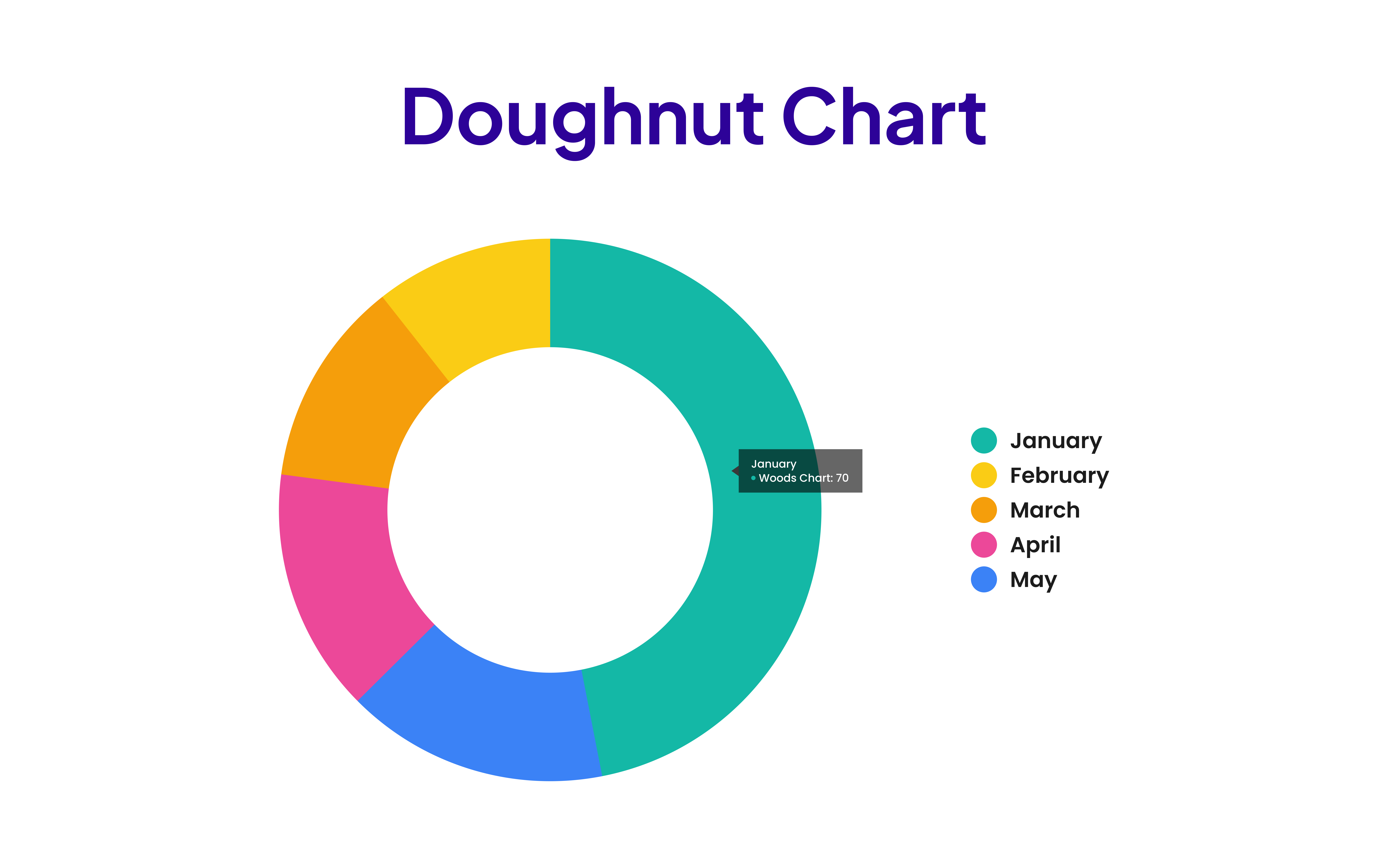
For instance, if you’re showing the composition of a whole, pie charts or doughnut charts can be highly effective. But if you have too many segments, the clarity can quickly diminish. Stick to the essentials, and avoid overcomplicating your visuals.

3. Consider the Audience
Your audience’s familiarity with the data and their needs should guide your chart selection. If you’re presenting to a team of data analysts, they might appreciate more complex visualizations like radar charts to compare multiple variables at once.
However, for a general audience, sticking to more straightforward charts like bar or line charts can help convey your message without overwhelming them.

4. Highlight the Key Insights
Your chart should do more than just display data—it should spotlight the key insights you want your audience to notice. Customization is key here. With advanced charting tools, you can adjust colors, labels, and more to highlight the most critical parts of your data.
Whether it's drawing attention to a peak in your line chart or a standout category in your bar chart, ensure your chart guides your audience to the conclusions you want them to draw.
5. Test and Iterate
Don’t be afraid to experiment with different chart types to see what works best. Sometimes, the most obvious choice isn’t the most effective. Try visualizing your data with various charts and gather feedback from colleagues or a small test group. What resonates? What feels unclear? Iterating based on this feedback can lead to a final product that truly connects with your audience.
Elevate Your Data with Digital Woods Chart Module for HubSpot
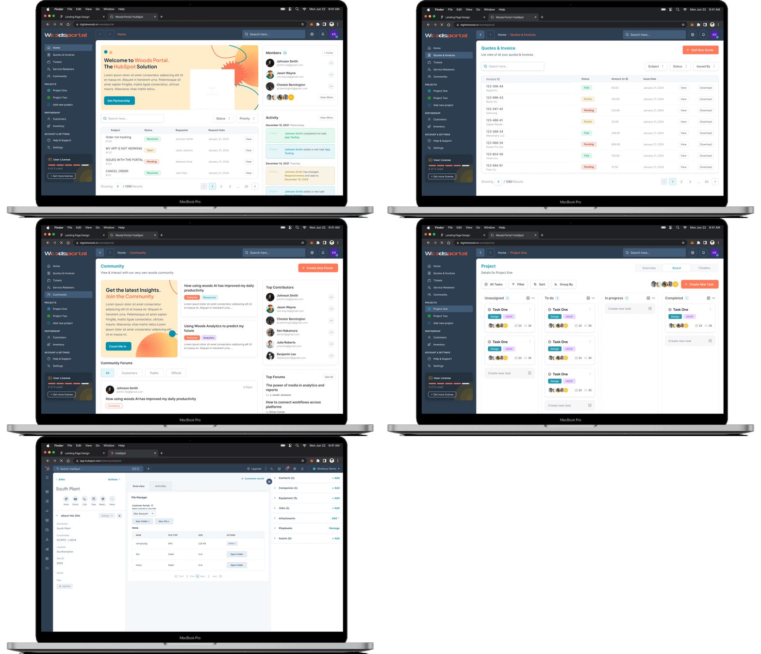
Now, imagine having a module that not only simplifies the process of creating these charts but also integrates seamlessly within HubSpot CMS. The Digital Woods Chart Module is designed to empower you to make data-driven decisions with ease and confidence.
Why Choose the Digital Woods Chart Module?
What makes our module a standout is its unbeatable responsiveness and customization. Your charts will dazzle on any device, from smartphones to desktops. Customize colors, labels, and data points to perfectly align with your brand, turning your data into captivating visuals that both inform and engage.
1. Easy to Use and Free to Access
Our module is available for free, offering a range of chart types—Bar, Pie, Radar, Line, and Doughnut—without any extra cost. Just like popular visualization tools, our module enables you to create stunning, data-driven visuals with a few simple clicks.
2. Full Customization for Maximum Impact
Customize your charts to reflect your brand's identity. Adjust colors, labels, and data points to create visuals that are informative, on-brand, and visually engaging.
3. Seamless Integration in HubSpot CMS
Designed to work natively within HubSpot, the Digital Woods Chart Module ensures that your data visuals are always accessible, responsive, and ready to impress, regardless of the device being used.
Transform Your Data Visuals in your HubSpot Website
Why settle for average data presentations when you can elevate your data storytelling?
Download the Digital Woods Chart Module for free and start creating compelling, interactive charts directly in HubSpot CMS today!


.png)
.png)


