
.png)
Flip your content into focus with seamless style
.png)
Personalize Styles
Custom styles to match your brand’s unique aesthetics and personality
.png)
Intuitive Interface
Navigate and manage smoothly with a user-friendly interface

Vivid Flips
Transform static slides into an engaging, immersive experience
Elegant Transition, Fluid Navigation
Enhance your site with fluid transitions and effortless navigation for a refined and engaging user experience
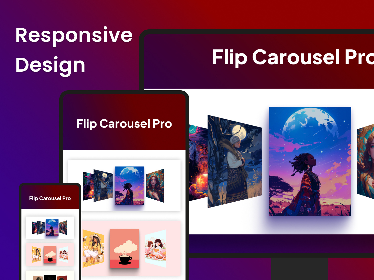
Responsive Design
Enjoy a stunning and smooth carousel experience across all devices with our fully responsive design. Whether viewed on a desktop, tablet, or mobile, the carousel dynamically adjusts to fit any screen size, ensuring consistent performance and visual appeal. This flexibility guarantees that your content remains engaging and accessible, providing a seamless interaction that captivates users no matter how they access your site.
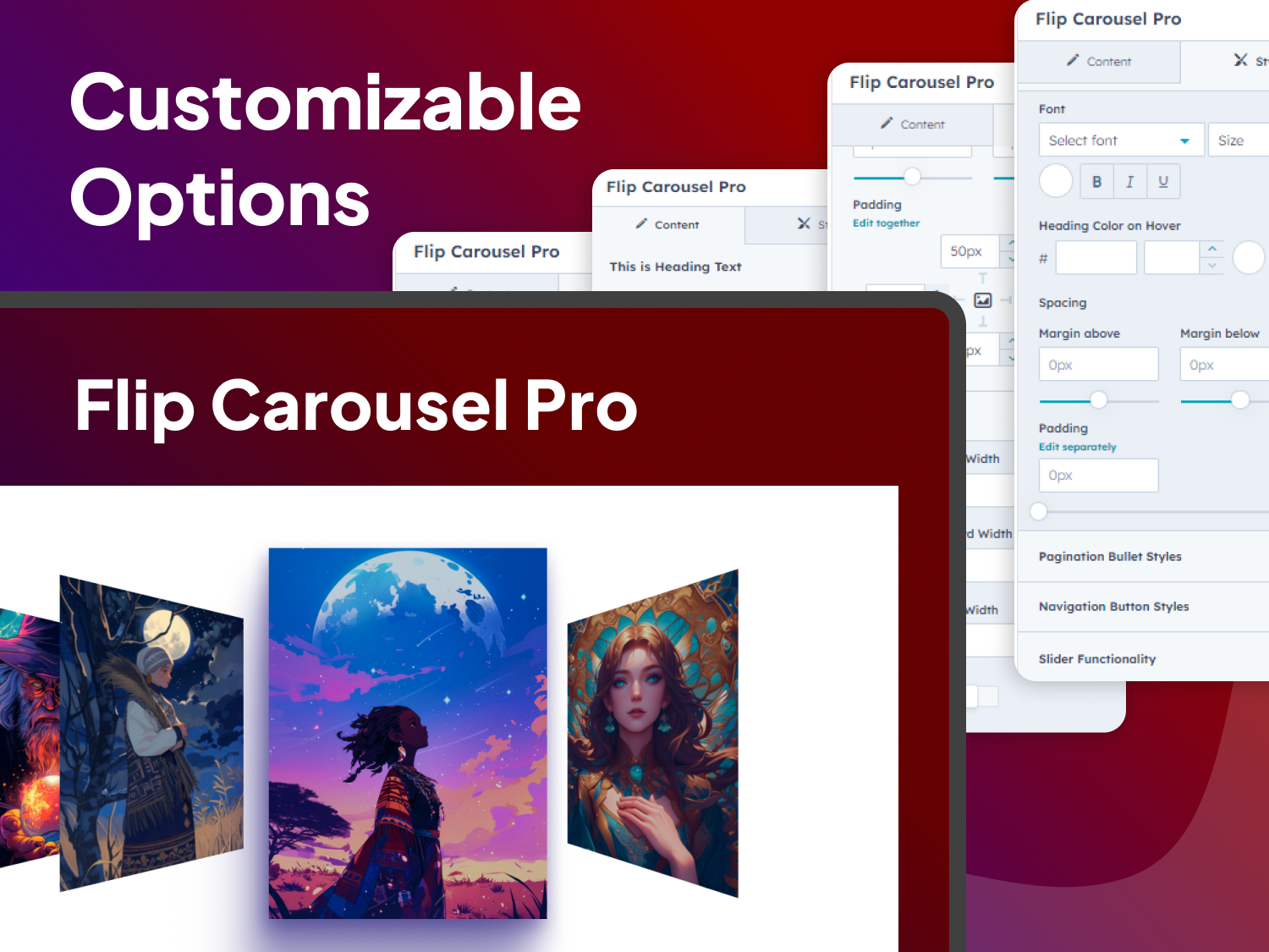
Endless Customization
Experience the ultimate in versatility with a carousel that adjusts flawlessly to any screen size. Whether viewed on mobile phones, tablets, or desktops, this module ensures your content remains visually stunning and fully functional. With its responsive design, it provides a seamless and engaging user experience across all devices, keeping your site looking sharp and interactive no matter how your audience connects.
Explore Similar Modules & Themes
