
Explore Product Documentation
Content Toggle
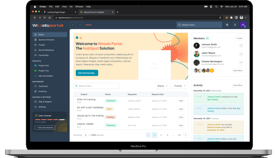
-png.png?width=1080&height=600&name=Main%20View%20(2)-png.png)
Overview
Revolutionize the way users interact with your site using the "Content Toggle" module. This versatile content switcher allows visitors to effortlessly switch between different sections or categories, offering a streamlined and engaging experience. Whether you're showcasing multiple products, features, or topics, the Content Toggle ensures that all your key information is easily accessible and neatly organized.
With a sleek, user-friendly interface, this module makes navigating complex content a breeze. Customize the toggle style to fit your design aesthetics, and provide a dynamic way for users to explore various sections without overwhelming them. Perfect for creating interactive and organized content displays, the Content Toggle module enhances usability and keeps your audience engaged.

Custom Content
Personalize your first and second tabs with distinct label text and add eye-catching icons for quick identification. Enhance your content with multimedia elements and detailed texts for each tab, ensuring a rich and engaging experience.

Style Switcher
Customize the label color and handler color to match your design palette, ensuring a cohesive look. Set the inactive background and text colors to clearly differentiate between active and inactive states, making navigation effortless and intuitive, for both the first and second content groups

Style Label Group
Tailor the fonts and typography for your first and second labels to match your brand’s unique style, ensuring each tab stands out with distinctive flair.

Personalize Content Group
Adjust padding to ensure your content has the perfect amount of space, choose a background color to complement your design, and set the border radius for smooth, rounded corners.

Custom Styles
Adjust label font size and weight for impactful text, and set precise distances to align labels perfectly. Tailor the wrapper’s width, height, and padding for an ideal fit, while choosing from various border types, colors, and widths to frame your content stylishly. Round off the look with a border-radius that adds a touch of elegance. Plus, position and size your icons with precision, and control their distance from labels to ensure a cohesive and polished interface.